CSS Guide
Overview
Stylesheets written in CSS (.css) files, can be used to control the appearance
(color, size, font and position) of the elements within the Fitbit application
user interface.
.label {
  fill: black;
  x: 0;
  y: 45%;
  width: 100%;
}
Adding a Stylesheet
In order to use a stylesheet, it must included within an SVG file.
<svg>
  <defs>
    <link rel="stylesheet" href="styles.css" />
  </defs>
</svg>
Selectors
The Fitbit rendering engine supports basic selectors in order to apply styling to an element.
The following simple selectors can be used:
Type selector:
text { font-family: System-Regular; fill: black; }
Applies to all elements of the specified type. e.g. <text>
Note: Using this selector may affect system components which use these elements.
Class selector:
.labels { font-family: System-Regular; fill: red }
Applies to all elements with the specified class name. e.g. class="labels"
ID selector:
#textbox { font-family: System-Regular; fill: blue }
Applies to the element with corresponding ID. e.g. id="textbox"
<svg viewport-fill="fb-cyan">
  <svg class="horizontal-pad">
    <text>I am black text!</text>
    <text class="labels">I am red text!</text>
    <text id="textbox">I am blue text!</text>
  </svg>
</svg>
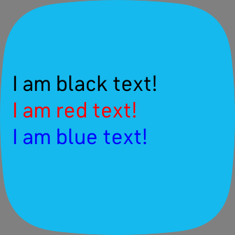
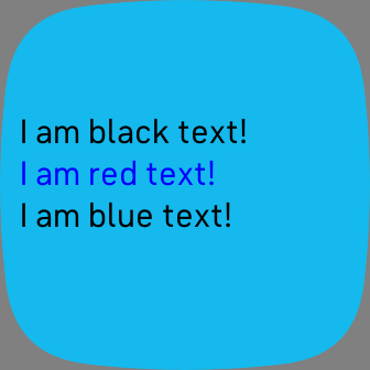
You can also use combinations of these selectors, and override previous values:
text.labels { font-family: System-Regular; fill: blue }
text#textbox { font-family: System-Regular; fill: black }
Fonts
Text elements can be styled using the system font, at any size or color. Embedding custom fonts is not supported at this time, but we recommend using a library like fitfont to generate images of each character.
font-family: "Font name";
.fancy { font-family: "System-Light"; }
System Font
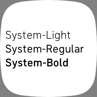
System-Regular, System-Light, System-Bold
In Fitbit OS 5, the System font is called Raiju:
Dimensions and Positioning
All sizes (width, height) and coordinates (x, y) can be
specified in either pixels or percentages (%).
Size
width: 60orwidth: 100%height: 60orheight: 100%
Coordinates
x: 5orx: 10%y: 5ory: 10%
You can also subtract pixels from percentages, such as 50%-10.
Coordinates are always relative to the parent svg element. In the following
example, the inner rectangle element will be positioned 20% from the top and
left of the screen, even though its x and y coordinates are 0. This is because
inner is positioned relative to its parent, container, and container's x
and y are defined as 20% of its parent's size (screen).
<svg class="screen">
  <svg class="container">
    <rect class="inner" />
  </svg>
</svg>
.screen { width: 100%; height: 100%; viewport-fill: lightblue; }
.container { width: 60%; height: 60%; x: 20%; y: 20%; }
.inner { width: 100%; height: 100%; x: 0; y: 0; fill: red; }

Previous element in container ($)
There is an additional special value $, which references the previous sibling
within the same container element. When $ appears in an x/y field, it
takes the value of the previous sibling's position in that axis, plus the
sibling's size (width or height) in the same axis. If there is no previous
sibling (i.e. the element is the first child in the container), $ evalutes to 0.
In this example, the item elements use $ in their y position,
stacking themselves vertically.
<svg class="screen">
  <svg class="container">
    <rect class="item" fill="fb-red" />
    <rect class="item" fill="fb-green" />
    <rect class="item" fill="fb-yellow" />
  </svg>
</svg>
.screen { width: 100%; height: 100%; viewport-fill: fb-cyan; }
.item { width: 100%; height: 27%; x: 0; y: $+5%; }

Colors
Colors can be specified in hexadecimal, or using named colors.
Hexadecimal
A 6-digit (or 3-digit shorthand), hexadecimal number that represents Red, Green, and Blue.
#RRGGBB or #RGB
text { fill: #FF9900 }
.labels { fill: #FFF }
Web Color Names
You can use any of the web standard color names within your applications.
text { fill: black; }
| Name | Hex | Color |
| aliceblue | #F0F8FF | |
| antiquewhite | #FAEBD7 | |
| aqua | #00FFFF | |
| aquamarine | #7FFFD4 | |
| azure | #F0FFFF | |
| beige | #F5F5DC | |
| bisque | #FFE4C4 | |
| black | #000000 | |
| blanchedalmond | #FFEBCD | |
| blue | #0000FF | |
| blueviolet | #8A2BE2 | |
| brown | #A52A2A | |
| burlywood | #DEB887 | |
| cadetblue | #5F9EA0 | |
| chartreuse | #7FFF00 | |
| chocolate | #D2691E | |
| coral | #FF7F50 | |
| cornflowerblue | #6495ED | |
| cornsilk | #FFF8DC | |
| crimson | #DC143C | |
| cyan | #00FFFF | |
| darkblue | #00008B | |
| darkcyan | #008B8B | |
| darkgoldenrod | #B8860B | |
| darkgray | #A9A9A9 | |
| darkgreen | #006400 | |
| darkgrey | #A9A9A9 | |
| darkkhaki | #BDB76B | |
| darkmagenta | #8B008B | |
| darkolivegreen | #556B2F | |
| darkorange | #FF8C00 | |
| darkorchid | #9932CC | |
| darkred | #8B0000 | |
| darksalmon | #E9967A | |
| darkseagreen | #8FBC8F | |
| darkslateblue | #483D8B | |
| darkslategray | #2F4F4F | |
| darkslategrey | #2F4F4F | |
| darkturquoise | #00CED1 | |
| darkviolet | #9400D3 | |
| deeppink | #FF1493 | |
| deepskyblue | #00BFFF | |
| dimgray | #696969 | |
| dimgrey | #696969 | |
| dodgerblue | #1E90FF | |
| firebrick | #B22222 | |
| floralwhite | #FFFAF0 | |
| forestgreen | #228B22 | |
| fuchsia | #FF00FF | |
| gainsboro | #DCDCDC | |
| ghostwhite | #F8F8FF | |
| gold | #FFD700 | |
| goldenrod | #DAA520 | |
| gray | #808080 | |
| green | #008000 | |
| greenyellow | #ADFF2F | |
| grey | #808080 | |
| honeydew | #F0FFF0 | |
| hotpink | #FF69B4 | |
| indianred | #CD5C5C | |
| indigo | #4B0082 | |
| ivory | #FFFFF0 | |
| khaki | #F0E68C | |
| lavender | #E6E6FA | |
| lavenderblush | #FFF0F5 | |
| lawngreen | #7CFC00 | |
| lemonchiffon | #FFFACD | |
| lightblue | #ADD8E6 | |
| lightcoral | #F08080 | |
| lightcyan | #E0FFFF | |
| lightgoldenrodyellow | #FAFAD2 | |
| lightgray | #D3D3D3 | |
| lightgreen | #90EE90 | |
| lightgrey | #D3D3D3 | |
| lightpink | #FFB6C1 | |
| lightsalmon | #FFA07A | |
| lightseagreen | #20B2AA | |
| lightskyblue | #87CEFA | |
| lightslategray | #778899 | |
| lightslategrey | #778899 | |
| lightsteelblue | #B0C4DE | |
| lightyellow | #FFFFE0 | |
| lime | #00FF00 | |
| limegreen | #32CD32 | |
| linen | #FAF0E6 | |
| magenta | #FF00FF | |
| maroon | #800000 | |
| mediumaquamarine | #66CDAA | |
| mediumblue | #0000CD | |
| mediumorchid | #BA55D3 | |
| mediumpurple | #9370DB | |
| mediumseagreen | #3CB371 | |
| mediumslateblue | #7B68EE | |
| mediumspringgreen | #00FA9A | |
| mediumturquoise | #48D1CC | |
| mediumvioletred | #C71585 | |
| midnightblue | #191970 | |
| mintcream | #F5FFFA | |
| mistyrose | #FFE4E1 | |
| moccasin | #FFE4B5 | |
| navajowhite | #FFDEAD | |
| navy | #000080 | |
| oldlace | #FDF5E6 | |
| olive | #808000 | |
| olivedrab | #6B8E23 | |
| orange | #FFA500 | |
| orangered | #FF4500 | |
| orchid | #DA70D6 | |
| palegoldenrod | #EEE8AA | |
| palegreen | #98FB98 | |
| paleturquoise | #AFEEEE | |
| palevioletred | #DB7093 | |
| papayawhip | #FFEFD5 | |
| peachpuff | #FFDAB9 | |
| peru | #CD853F | |
| pink | #FFC0CB | |
| plum | #DDA0DD | |
| powderblue | #B0E0E6 | |
| purple | #800080 | |
| red | #FF0000 | |
| rosybrown | #BC8F8F | |
| royalblue | #4169E1 | |
| saddlebrown | #8B4513 | |
| salmon | #FA8072 | |
| sandybrown | #F4A460 | |
| seagreen | #2E8B57 | |
| seashell | #FFF5EE | |
| sienna | #A0522D | |
| silver | #C0C0C0 | |
| skyblue | #87CEEB | |
| slateblue | #6A5ACD | |
| slategray | #708090 | |
| slategrey | #708090 | |
| snow | #FFFAFA | |
| springgreen | #00FF7F | |
| steelblue | #4682B4 | |
| tan | #D2B48C | |
| teal | #008080 | |
| thistle | #D8BFD8 | |
| tomato | #FF6347 | |
| turquoise | #40E0D0 | |
| violet | #EE82EE | |
| wheat | #F5DEB3 | |
| white | #FFFFFF | |
| whitesmoke | #F5F5F5 | |
| yellow | #FFFF00 | |
| yellowgreen | #9ACD32 |
Fitbit Named Colors
You can use any of these Fitbit named colors to easily match your application with the colors used by system applications. Be aware that the specific color values may change in future system updates. These colors match the definitions in Fitbit OS 5.0.
text { fill: fb-indigo; }
| Name | Hex | Color |
| fb-aqua | #3BF7DE | |
| fb-black | #000000 | |
| fb-blue | #4D86FF | |
| fb-cerulean | #8080FF | |
| fb-cyan | #15B9ED | |
| fb-dark-gray | #505050 | |
| fb-extra-dark-gray | #303030 | |
| fb-green | #2CB574 | |
| fb-green-press | #134022 | |
| fb-indigo | #5B4CFF | |
| fb-lavender | #8173FF | |
| fb-light-gray | #A0A0A0 | |
| fb-lime | #72B314 | |
| fb-magenta | #F1247C | |
| fb-mint | #5BE37D | |
| fb-orange | #FF752D | |
| fb-peach | #FFCC33 | |
| fb-pink | #FF78B7 | |
| fb-plum | #A51E7C | |
| fb-purple | #C658FB | |
| fb-red | #FA4D61 | |
| fb-slate | #7090B5 | |
| fb-slate-press | #1B2C40 | |
| fb-violet | #D828B8 | |
| fb-white | #FFFFFF | |
| fb-yellow | #F0A500 | |
| fb-yellow-press | #394003 |
Opacity
You can specify opacity to control the transparency of an element. Specify a
value between 1.0 and 0.0. The lower the value, the more transparent it is.
text { opacity: 0.3 }
Borders
The Fitbit rendering engine does not support the CSS stroke or border properties. To achieve a similar effect you need to draw two overlapping shapes.
The larger background shape should be filled with the desired border color, and the smaller foreground shape should be filled with the desired foreground color.
For example, here is a gray circle with a black border. Notice that the
background circle has a larger radius r.
<svg viewport-fill="fb-gray">
  <circle cx="50%" cy="50%" r="80" fill="fb-black"/>
  <circle cx="50%" cy="50%" r="78" fill="fb-gray"/>
</svg>
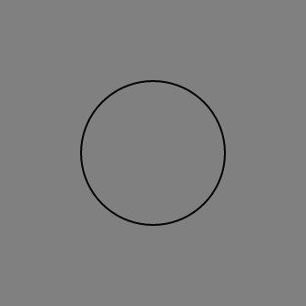
Image Grayscale Magic!
Grayscale images can be colored dynamically with the fill property. The black
area of an image will be fully transparent (0) and the white will be fully
opaque (255). All the mid-gray areas will inherit opacity according to their
depth of color (0 - 255).
Note: The image must be 8-bit PNG format.
In the example below, the second hand on the clock has been filled with a color, but is actually just a grayscale image of a white hand on a black background.
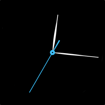
Let's take a look how it's made.
Here's the black and white clock hand image:

The svg contains an image tag, which uses the black and white clock hand
image.
<svg>
  <image width="100%" height="100%" href="hand.png" class="seconds" />
</svg>
Then we apply the chosen fill color, and opacity within our CSS stylesheet.
.seconds { fill: #3fc0fc; opacity: 1; }
Aside from making UI more adjustable to color changes, the use of grayscale images reduces the size memory usage by a factor of 4.
You can generate images in the correct format by using the following ImageMagick command:
convert original.png -colorspace gray final.pngOr, in Adobe Photoshop set Image Mode > Grayscale, 8 Bits/Channel.
Horizontal Text Alignment
text-anchor: start | middle | end
text { x: 50%; text-anchor: middle; }
Used to align a string of text horizontally relative to the x-coordinate
specified by the x attribute.
start: the start of the text is at the x-coordinate.middle: the middle of the text is at the x-coordinate.end: the end of the text is at the x-coordinate.
Monospace Numbers
The firmware doesn't include any monospace fonts (fixed width), but we have included monospace numbers within some of the existing fonts. These can be accessed using the character codes 0x10-0x19 (where 0x10 is zero).
The following example takes a string of numbers, and converts them to their monospace equivalent.
//app/index.js

function updateClock() {
  var today = new Date();
  var hours = util.monoDigits(today.getHours());
  var mins = util.monoDigits(util.zeroPad(today.getMinutes()));

  myLabel.text = hours + ":" + mins;
}

//common/util.js

// Convert a number to a special monospace number
export function monoDigits(num, pad = true) {
  let monoNum = '';
  if (typeof num === 'number') {
    num |= 0;
    if (pad && num < 10) {
      monoNum = c0 + monoDigit(num);
    } else {
      while (num > 0) {
        monoNum = monoDigit(num % 10) + monoNum;
        num = (num / 10) | 0;
      }
    }
  } else {
    let text = num.toString();
    let textLen = text.length;
    for (let i = 0; i < textLen; i++) {
      monoNum += monoDigit(text.charAt(i));
    }
  }
  return monoNum;
}

const c0 = String.fromCharCode(0x10);
const c1 = String.fromCharCode(0x11);
const c2 = String.fromCharCode(0x12);
const c3 = String.fromCharCode(0x13);
const c4 = String.fromCharCode(0x14);
const c5 = String.fromCharCode(0x15);
const c6 = String.fromCharCode(0x16);
const c7 = String.fromCharCode(0x17);
const c8 = String.fromCharCode(0x18);
const c9 = String.fromCharCode(0x19);

function monoDigit(digit) {
  switch (digit) {
    case 0: return c0;
    case 1: return c1;
    case 2: return c2;
    case 3: return c3;
    case 4: return c4;
    case 5: return c5;
    case 6: return c6;
    case 7: return c7;
    case 8: return c8;
    case 9: return c9;
    case '0': return c0;
    case '1': return c1;
    case '2': return c2;
    case '3': return c3;
    case '4': return c4;
    case '5': return c5;
    case '6': return c6;
    case '7': return c7;
    case '8': return c8;
    case '9': return c9;
    default: return digit;
  }
}
Standard Definitions
There are a handful of CSS classes that your application should define in order to assist with the default styling of system elements. These classes mean you only have to define these colors once and the text, buttons, etc will use them.
.application-fill           { fill: fb-cyan; }
.app-gradient-background    { fill: fb-blue; }
.foreground-fill            { fill: fb-white; }
.background-fill            { fill: fb-black; }
For example, to generate the background gradient:
<svg>
  <use href="#app-gradient-background" class="app-gradient-background application-fill" apply-style="at-use">
    <svg><!-- content --></svg>
  </use>
</svg>

Helper Classes
By importing the system widget definitions into your project, you can utilize some system CSS classes that ease the development process.
The definitions are as follows:
/* Typography sizes */
.h1  { font-size: 80; line-increment: 100; font-weight: bold;}
.h2  { font-size: 50; line-increment: 60;  font-weight: bold;}
.h3  { font-size: 34; line-increment: 42;  font-weight: bold; font-step-size: 4; min-font-size: 24; }
.h4  { font-size: 28; line-increment: 34;  font-weight: bold; font-step-size: 4; min-font-size: 24; }
.h5  { font-size: 22; line-increment: 26;  font-weight: bold;}

.p1  { font-size: 34; line-increment: 42; font-step-size: 4; min-font-size: 24; }
.p2  { font-size: 28; line-increment: 34; font-step-size: 4; min-font-size: 24; }
.p3  { font-size: 22; line-increment: 26; }

/* Helpers */
.stack-gap                       { y: $+6; }
.center-text                     { text-anchor: middle; display-align: center; }
.horizontal-pad                  { x: 18; width: 100%-36; }
.horizontal-pad-header           { x: 30; width: 100%-60; }
.touch-area                      { width: 100%; height: 100%; opacity: 0;}
.uppercase                       { text-transform: uppercase; }
.full-size                       { x: 0; y: 0; width: 100%; height: 100%; }
To use these helper classes in your project, you need to import the
system_widget.defs in your widget.defs file:
<svg>
  <defs>
    <link rel="import" href="/mnt/sysassets/system_widget.defs" />
    <link rel="stylesheet" href="styles.css" />
  </defs>
</svg>
Then just use the classes within your markup:
<svg>
  <svg class="horizontal-pad">
    <text class="h1 center-text application-fill" x="50%">Heading1</text>
  </svg>
</svg>

Web CSS Differences
There are a number of differences between Fitbit CSS and traditional web CSS:
- Don't specify units for:
font-size,letter-spacing. e.g.font-size: 120notfont-size: 120px. - Advanced selectors such as child, descendant or attribute selectors are not currently supported.


